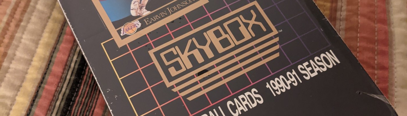
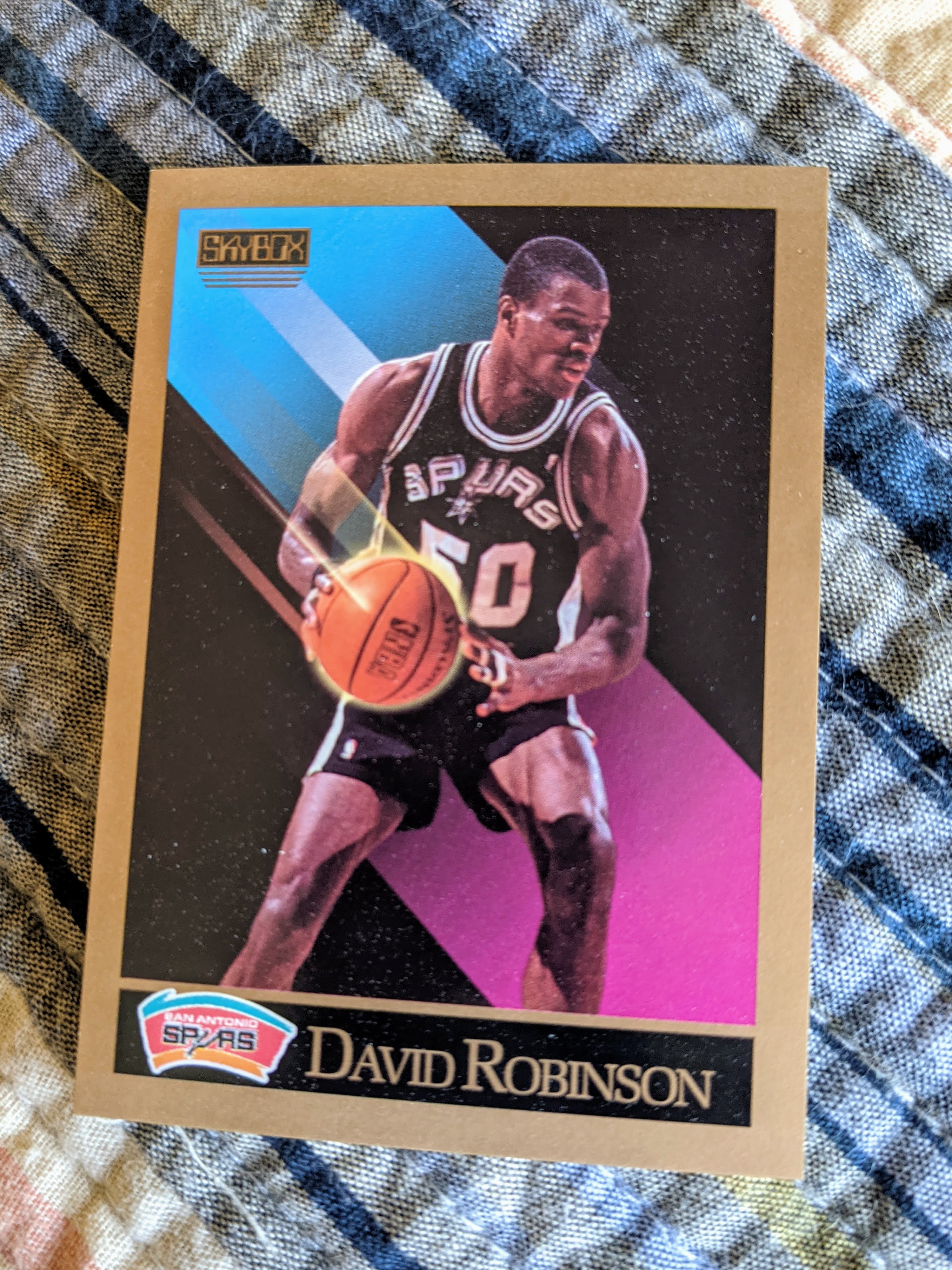
When I first started collecting sports cards in the late 1980s and early 1990s, I remember when Skybox hit the scene. It was 1990, and Skybox’s parent company, which I now know was a spin-off of a tobacco company’s memorabilia business (strange and yet somehow such a 1980s American story), packaged futuristic looking basketball cards with “computer graphics” and “advanced statistics” (they seem to have invented the concept of extrapolating a player’s per-game statistics over a full 48-minute game, which has since been revised to the Per 36 Minutes concept) in a black foil wrapper. That first set also had rookie/first year cards for a lot of great players, including David Robinson, Sean Elliott, Shawn Kemp, and Glen Rice.

So I was excited to score a box of these babies for $30 on eBay. My best friend, Casey, was never a hardcore sports card collector, but he remembered his brother having some of these cards with their distinctive gold borders and flashy graphic design. I thought maybe I’d buy the box and open some of the packs on a video call with my friend, and we could “remember some guys” through the experience. But I decided I wanted to open a few packs myself first, just to see what they were like.
That was about two months ago.
Yes, I’ve tended to take my time with my retro boxes. I savor them, opening a few packs a day rather than ripping them all in one session. But this hasn’t been so much a savoring experience as much as me avoiding the task.
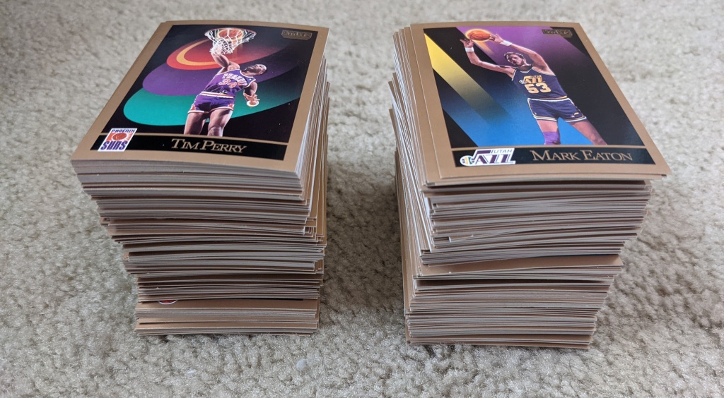
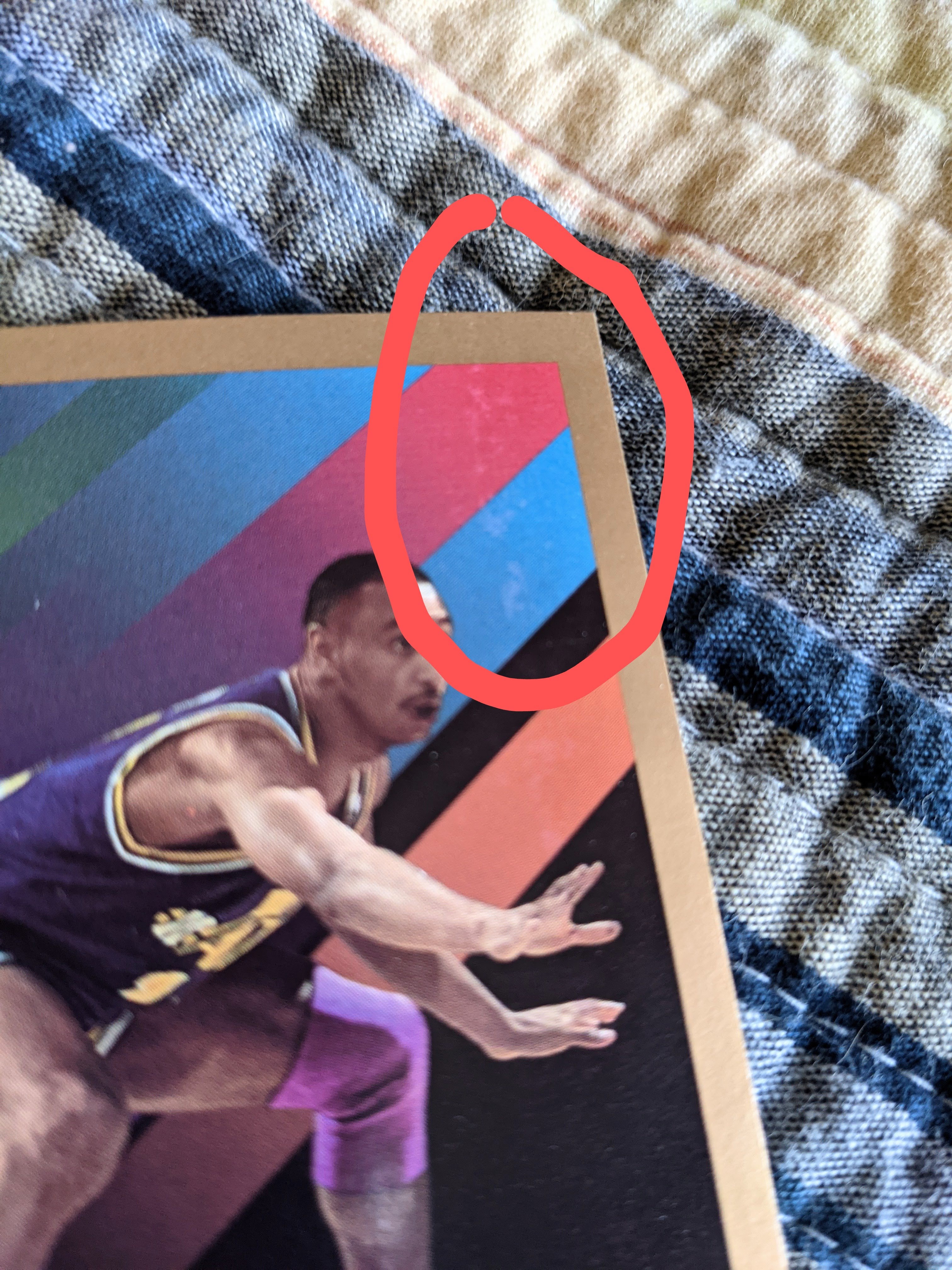
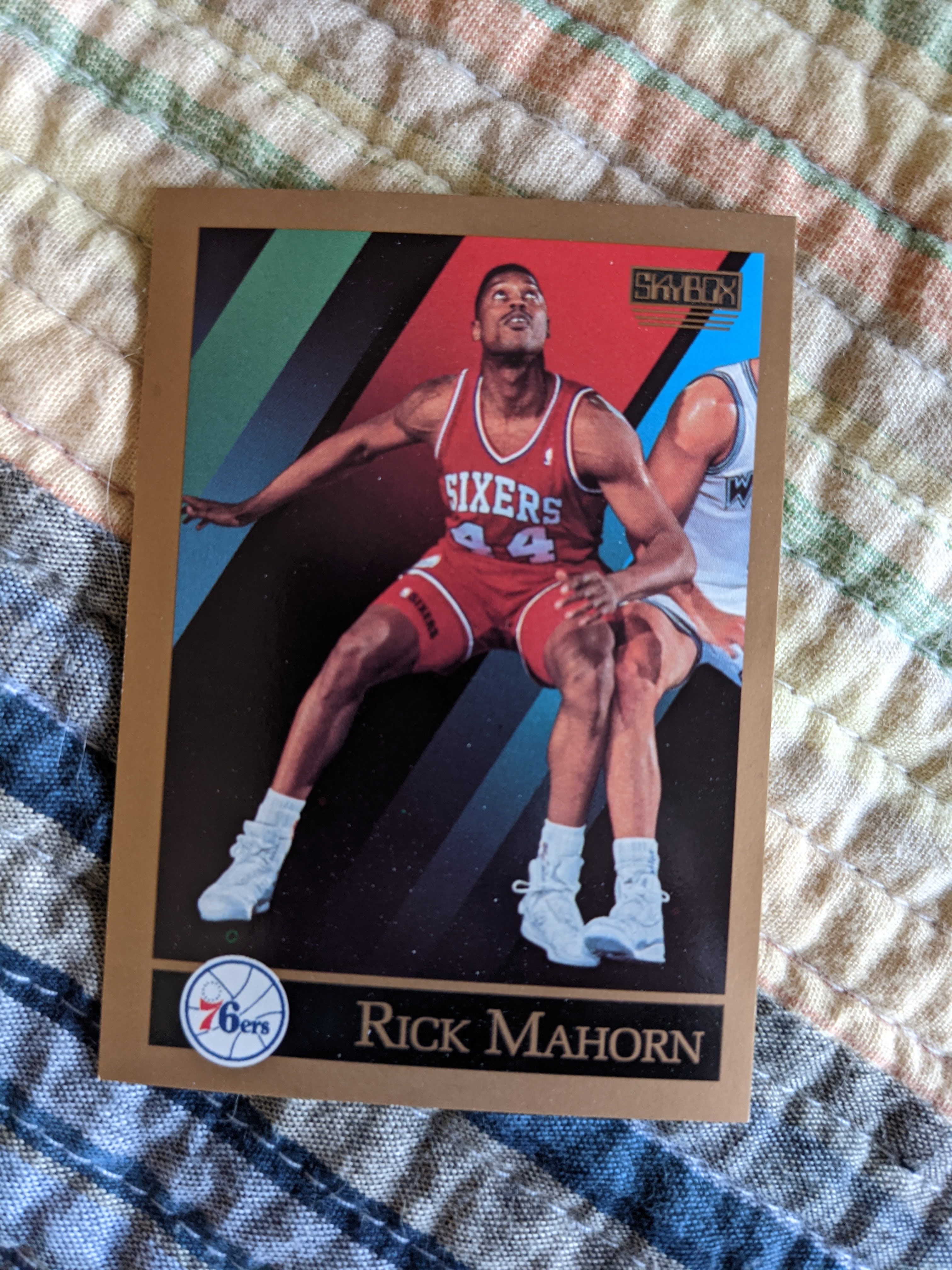
What I quickly realized with these cards is that quality control was clearly a problem with my box, if not the whole first run of the first series of Skybox basketball. Every pack I opened had offcenter images, damaged cards, and as I realized when I started stacking up my commons, they’re pretty much all bowed.
This was a sealed box, so it’s not like whoever sold this to me “knew” that the cards were like this. And while perhaps the bowing could be attributed to the cards being stored in poor conditions (cold, hot, both?), that doesn’t explain the miscuts, the various kinds of edge damage, the flecks of ink/missing ink, etc. that I found throughout each pack.
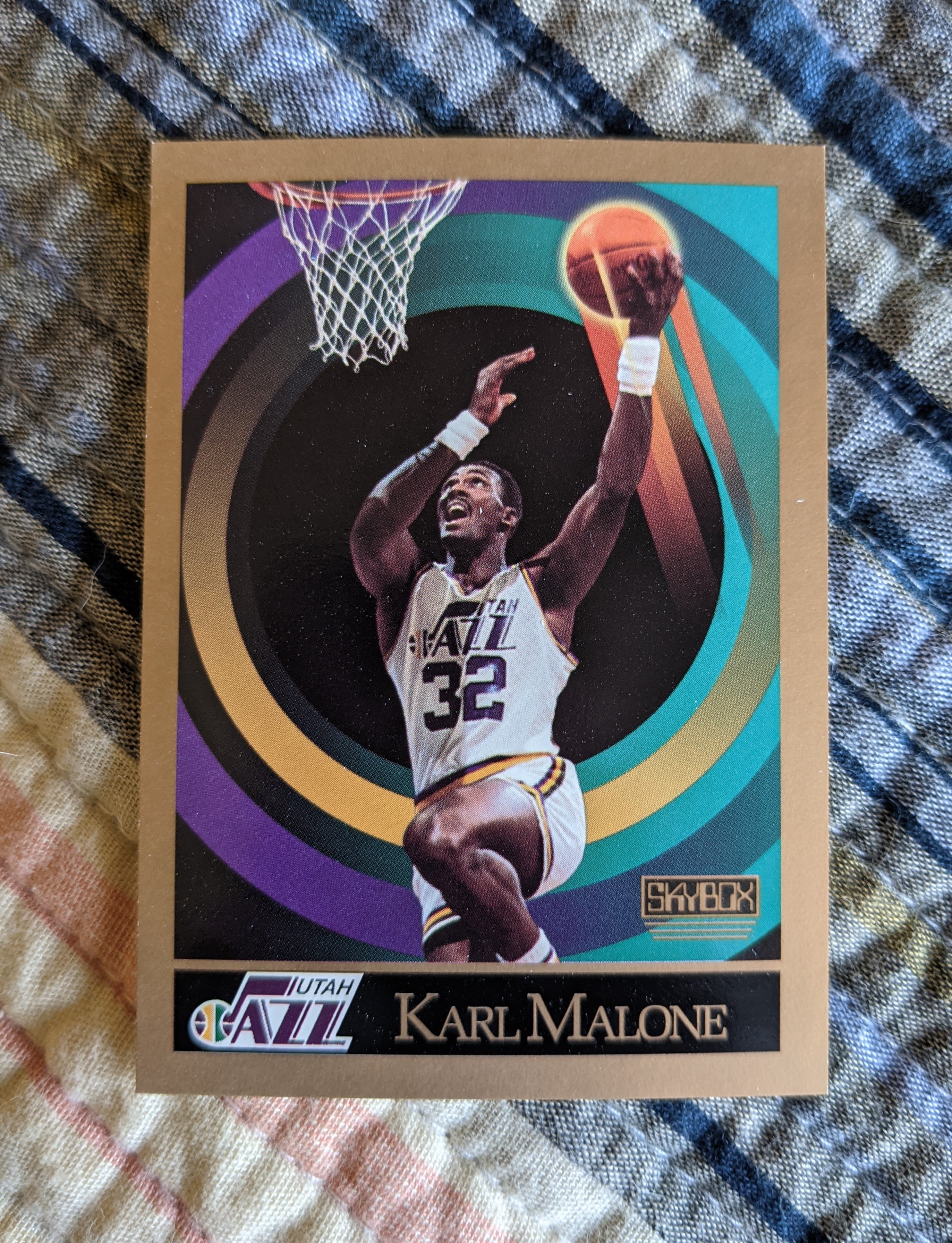
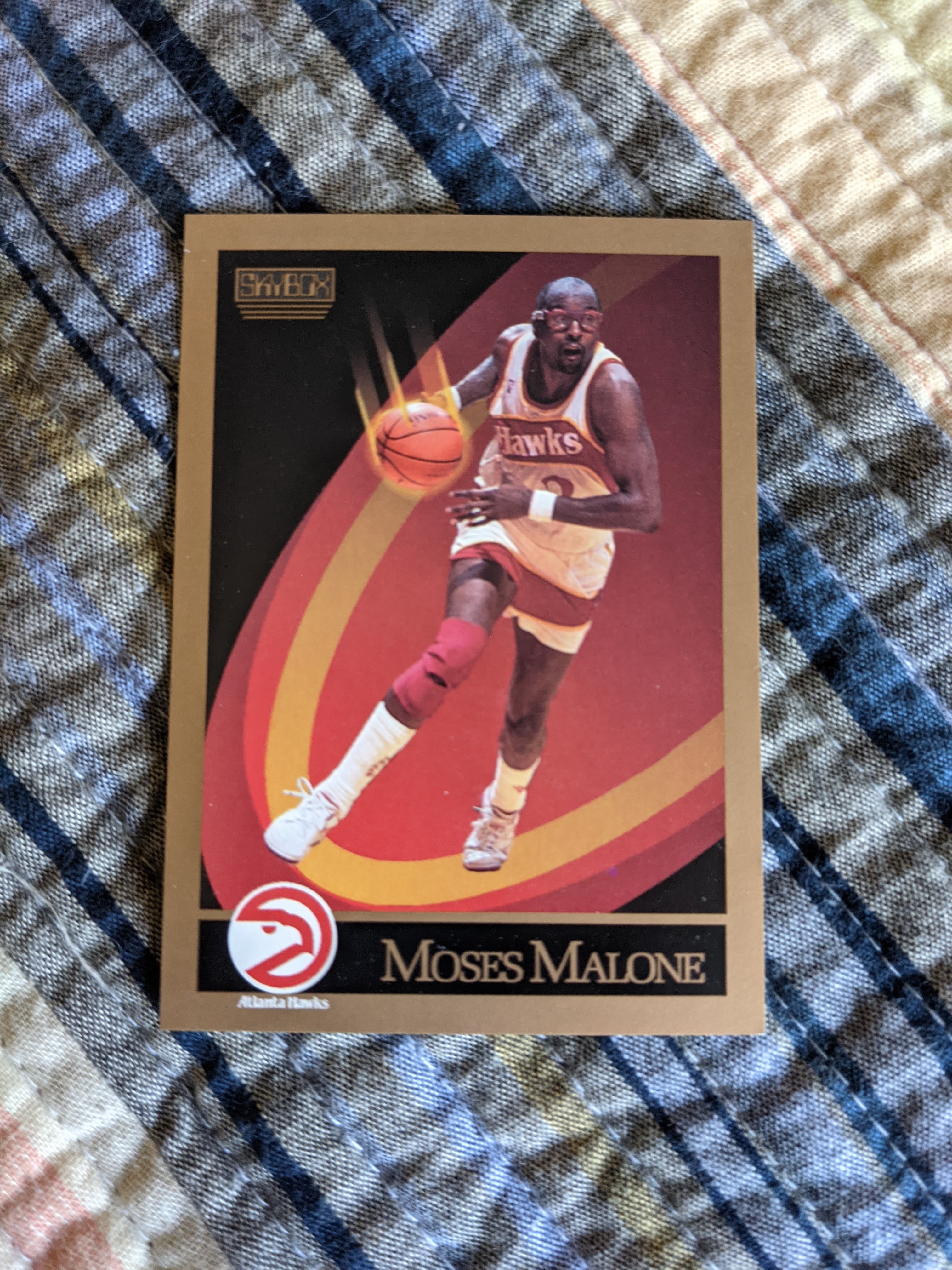
Here’s a photo slideshow of some of the more easily photographed types of mishaps I found, a hall of horrors, if you will:


When I open a box, I usually log all the cards I open in a spreadsheet so I have all the information I need to write about the box at the end. But this time, I stopped after pack 23 (of 36) out of boredom and frustration with the never-ending parade of offcenter and damaged cards. Before I stopped recording the cards, I did some analysis and found that:
- 129 of the 345 cards were noted as offcenter to some degree, 37 percent. And to be honest, there were at least some cards I didn’t bother to note as offcenter early on because they were only a little off. But they were still off. So that 37 percent, more than 1 in 3 cards, is a conservative estimate.
- 34 of the 345, or about 10 percent, were noted as damaged out of the pack in some way, usually with a strange ding on the top edge of the first card in a given pack. Again, I didn’t note every single card with a slight bend or scuff, so 10 percent is probably closer to 15 percent of the cards coming out of packs with noticeable damage, if I had to guess.
- And only 11 of the 345 cards, or 3 percent, had both noticeable damage and offcenter images. So 152 cards, 44 percent, had either damage or offcenter images, 11 had both, and 163 cards in total, 47 percent — nearly half! — were bad right out of the pack.
I mean good lord, no wonder this box took me like two months to get around to opening all the way. I open packs for enjoyment, but every time I opened one of these packs, I winced in anticipation of what damage and crud I would find. I couldn’t even get excited about the prospect of a Michael Jordan card or a Shawn Kemp rookie, because the odds of those cards even being worth hanging onto were no better than a coin flip.
Funnily enough, there was a Shawn Kemp rookie in the very first pack I opened. And it was offcenter. I got another one later in the box, and it was also offcenter, to the same side, even. They both also have a little damage to the left edge.

And I did wind up pulling one Michael Jordan, and it’s actually pretty well centered, but it’s got … for lack of a better word, it’s got a booger on it.

It’s not easy to photograph, but you can kinda see it there in the middle of the card, in the computer generated contrail of the ball, just a little chunk of something that I can’t scrape off. I guess it’s a good thing these cards aren’t worth big money, even in mint condition, because even as a relatively laid-back hobbyist collector, I’d be pretty miffed if I missed out on having a high-dollar card because of offcenter printing and mystery booger crust.
One other major quality control issue that’s somewhat related to the two Shawn Kemps I pulled: There were 10 of 36 packs that were essentially duplicates. Said more exactly, there were five pairs of packs in which 13 of the 15 cards were the same, and in the packs that had Shawn Kemp rookies (and Glen Rice rookies, crazily enough), even the order of the cards and the centering and other problems were the same on each card.
I talked to my friend Casey about this phenomenon and he was telling me about how some of the early packs of Magic: The Gathering were like this, something about the printing order being set in a very rudimentary way to where you would know what other cards were in a pack based on the first couple to be revealed. So clearly it’s a similar thing here, with an inexperienced trading card company utilizing too-simple, error-prone printing procedures.
So all in all, it’s somewhat difficult to be objective about this set because I’ve had such a bad time opening this particular box. But I’m going to whip out my new rating rubric and see if I can judge these cards on their qualities beyond the pain of all these problems.
Design: 4 of 5
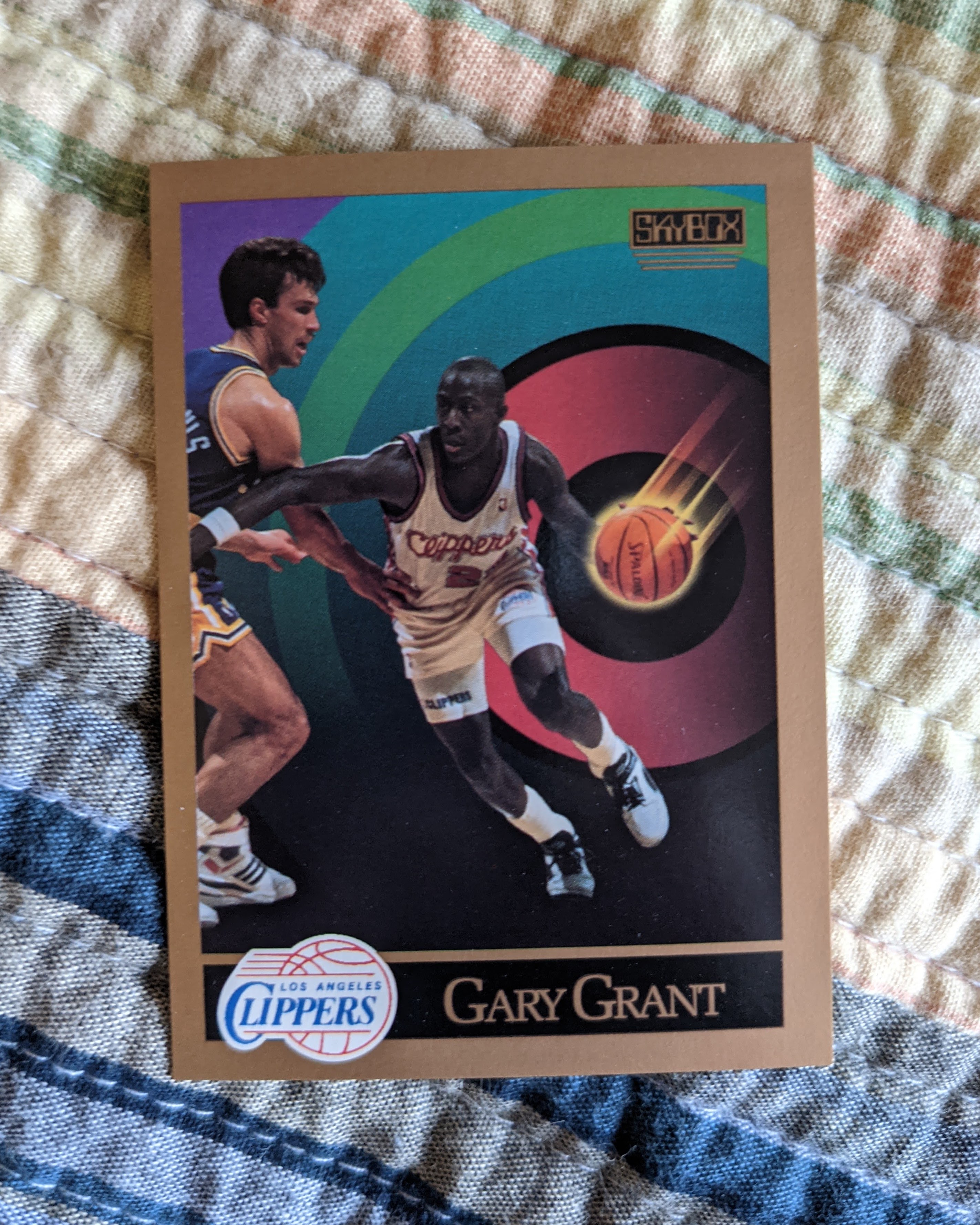
I have to admit that as I opened the first few of these packs, my first reaction was “these are uglier than I remember.” The gold border and the dark backgrounds felt kind of oppressive, somehow. As I continued, though, I realized that my initial reaction may have had more to do with the disappointment of so many offcenter cards (any offcenter card immediately makes me cringe, no matter how pretty), and I started to appreciate their beauty. It’s not like the photography is great (more on that later), but this presentation really seems to maximize what they had to work with. The use of computer graphics, which were more or less unprecedented in their day, help highlight the players themselves.

Plus, the graphics are understated and classy in a way I wouldn’t have expected from the wild and crazy, way-out 1980s and ’90s, known for super harsh dayglo neon colors and in-your-face graphic design on everything from clothes to school supplies. There’s Zubaz pants on one end of the spectrum, and then on the other end, there’s these cards with their well-picked color palette that highlights and complements the team colors of the player on the card. There are teals and pinks, but they’re not TEAL and PINK in an aggressive way. And while the backs aren’t revolutionary, they feature a good, large photo of the player and some statistics that help place each player in their context, including league average stats for their position. They also pull in some of the gold from the front.
In their day, these were quite revolutionary. Today, once I look past the production issues, I see these are still pretty solidly designed. My main beefs with the design are font-related. The name on front font is pretty ugly, and tends to get all smooshed up with longer names, and I’m not sure why they put the player’s first name (or nickname in some cases) in that strange script font on the back.
Card feel: 3 of 5
This is a hard one to be objective about with the bowing and the nicks and cuts, but I would say in general these are sturdy cards. Compared to other cards of the era, they’re printed on a higher-end stock (with white instead of brown cardboard) and while the cards aren’t super glossy, they do have a better coating on their front than most of the non-Upper Deck competitors of the day. I’m thinking in particular of a few of the chintzy Fleer sets from this era, some of which seemed like they were cut out of cereal boxes. The bowing is a problem, but I’ve seen bowing with more modern, thick-stock, glossy cards as well, so it’s not specific to this set or its stock.
But they clearly hadn’t figured out the production part, since I’m guessing the unmoveable “booger” on the Jordan card is probably related to the gloss coating. This rating would probably be a 4 as well if it wasn’t for that kind of stuff.
Photography: 3 of 5
There seem to be two almost totally different photography philosophies in play on these cards: one for the fronts and one for the backs. The fronts are generally standard action shots for the era. Some are kind of out of focus, some are not color corrected properly. They’re fine — maybe even on the higher end of quality for the era — but unremarkable.
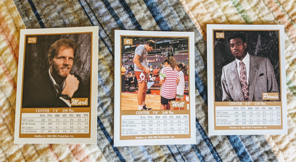
The backs feature a lot of cute candid types of photos, like the one above of Will Perdue signing autographs in his warmups before a game, and a lot of fun and ’90s-fashioned posed studio photos, like the ones above of 1990 No. 1 draft pick Pervis Ellison and Jazz center Mark Eaton. But there are also a high number of clunkers, including an astounding selection of players looking vacant and slack-jawed on the bench or at the free-throw line.
All in all, though, I’d rate the photography right on the high side of average, even when adjusting for the pre-digital era.
Fun factor: 1.67 of 5
Calculating the average Andrew Taylor Recommends Excitement ratings for the packs I did record (I rate each pack on a scale of 0 to 5 based on how excited I am about the pack at the moment I open it), noting that I for some reason gave a 4 out of 5 to a pack where the best player was Rik Smits (I resisted the urge to go back and change ratings after the fact; I must have had a good reason at the time for feeling good about that pack), I gave this box a 1.67 on a scale of 5. That’s a new low for this blog. I didn’t rate the last 13 packs, and I have a feeling it would have dipped even a little lower if I had. Plenty of zeroes in the mix, and no 5s. Besides the 4 for the first pack (a Shawn Kemp! A Clyde Drexler! A Glen Rice! But some are offcenter!) and the bizarre Rik Smits pack rating, I also gave a 4 to the Jordan pack (would have been a 5 without the booger). If the production issues hadn’t been there, this could have easily ranked up there with the Upper Deck inaugural NBA box I opened.
Overall rating: 2.91 of 5
Averaging the ratings together as we do here, evenly weighting each of the four categories, we end up at a rating just shy of 3 out of 5. I think that’s a fair overall reflection of my opinion on this set. It was a bit of a groundbreaking release, special in its era, but it doesn’t check all the boxes for a truly great set of sports cards. And if these production issues are at all reflective of what was happening with the other Skybox boxes and packs that season, that’s a problem that can’t be overlooked in the larger picture of the set. Skybox cards got better and even cooler as the years wore on, though, so the company was clearly serious about being a major player in trading cards.
Skybox no longer exists, unfortunately, but they started on a promising note with this set. Although I wouldn’t necessarily recommend buying a box of this series and season unless you’re ready to deal with a bunch of badly cut cards, I would say if you can find a box of series 2 from this season, or the clean and crisp 1991-92 basketball set for a little bit of money, it might be worth the risk to see if they cleaned up their act, so to speak.

[…] seen this many cards with this much corner and edge damage fresh out of packs since that box of first-season Skybox NBA I opened a while back. That was a set made by a first-time manufacturer about 30 years ago. I’m not sure […]
LikeLike